
# website design# website development# top picks
6 Actionable Responsive Website Design Optimisation Tips
Responsive website design is the art of improving how your site looks and feels across a range of screen sizes and devices.
Mobile is the way of the future, not the past, and many websites still lack the look and feel of a great website.
According to research, mobile users have taken ahead of desktop users as of 2014, so now is the time to be ensuring that your site works well across a range of devices.
So in this article, I'm going to give you the best responsive website design optimisation tips from my tool belt that you can implement into your site today.
Are you prepared for them? Grab a piece of paper and pen and let's dive straight in...
Website Optimisation Tip #1: Speedy web hosting

Without fast web hosting, your website, even if you've got plugins to optimise your site, it'll run so slowly that people are going to be leaving your website before they get a chance to see it.
There's many different types of web hosting that you can go for, free web hosting is one of them. But I'd stay well clear of free web hosting if you're trying to increase your ranking in Google, which we're all trying to do right?
Website hosting will go a long way, putting some thought into the type of hosting to go for now will ensure that you set up your site for success for years to come.
This is sometimes hard to see though, and as a business owner, you might be fighting a battle in your head about whether to make the upfront investment in good web hosting now, or whether to go for expensive web hosting from the start.
If you do decide to go for free web hosting from the start, there's a good chance that your site's ranking in the search engine is going to be affected, and as a result your website could experience downtime.
Website Optimisation Tip #2: Design for mobile

Responsive website design is a big part of website design and driving organic search traffic to your site.
However, it's still an area that websites can fall behind on.
There's many websites on the internet, and us humans typically carry around a "computer-like" smartphone in our pockets wherever we go so that we can access the web on the move.
This can be a positive thing for your business online, but ultimately, if you're not designing for mobile, how will your users have the best experience of your website?
They won't.
We've got an article explaining why responsive website design is so important in today's digital world, so suggest taking a look at that article as well where I dive into more detail about getting your website looking and feeling great for a wider range of devices.
Website Optimisation Tip #3: Compress and minify your assets
By this, we're talking about several components that make up your web page, more specifically...
Images, CSS, JS and your HTML.
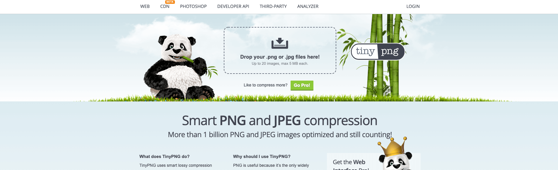
You need to be using tools such as TinyPNG for compressing the size of your images, and tools such as CSS Compressor for ensuring that your CSS on your website is all nicely optimised and served to the user's browser efficiently.
Did you know that after the "Speed Update" from Google back in 2018 Google has given a bigger SEO score to those websites that have optimised content and site assets.
I know that it can get tiring having to compress images each and every time you want to upload a new image to your site, and sometimes you might forget, and that's okay for a few instances...
But imagine if every single image on your website wasn't optimised?
Imagine if you had 500 images throughout your site, and each image on average was around 500Kb in size, you could be looking at an excess of 250Mb of imagery, where as if you had compressed your images, you could be saving upwards of 40% in file space.
These numbers really do add up over thousands of images and hundreds of pieces of content on your website.
Website Optimisation Tip #4: Less is more, more whitespace is good

On a mobile device, or a small screen such as a tablet, there isn't often much room to display a lot of content without having the user have to scroll a lot.
Now a common myth is that users don't scroll, and this simply isn't true. There's many myths out on the web, and when dealing with web clients you're likely going to come across those who believe users don't scroll.
As a website owner, entrepreneur and business enthusiast, it's your responsibility to iterate and ensure that your website is optimised and has enough whitespace.
You see, less is more.
You've heard of the saying that an image can tell a thousand words right?
The same situation is true for that of content and whitespace on your website. Don't assume that just because you've got buckets of content all squashed together on your site that users are going to read through all of that.
Chances are, they won't.
Do yourself a favour and just take a good look through your site on Google Analytics and find out what pages are getting the least traction, it might very well be that they've simply got too much content on them and users are put off by this.
So reduce the content and get more whitespace in there.
Website Optimisation Tip #5: Remove flash

I'm not typically a negative person, but Flash is a thing of the past. Despite how great websites might look with Flash on them, it's simply not worth the time nowadays.
In fact, if you use Flash on your website, you could actually be making your website look more like a scam website, and you certainly don't want to have that reputation.
In the earlier days of Internet Explorer, Flash was the biggest thing going, unfortunately, Internet Explorer is only really seen in large scale organisations such as medical organisations or potentially the police.
Even then, hardly anyone uses this browser.
Instead, focus your efforts on designing a website that looks great - you want a sleek looking website.
Take our site for instance, we've got modern, material design colours and content that has enough whitespace to keep it fresh.
We don't use Flash.
Want to know another reason why Flash shouldn't be used?
There have been some previous security concerns raised over the framework, which has resulted in becoming less attractive for responsive web design and web design in general.
Despite its "old fashioned" concept, Flash can still be found in Games, and that's where it should stay!
Website Optimisation Tip #6: Remove irrelevant pop-ups

Irrelevant pop-ups are found everywhere. Like seriously, whenever you go to a website and try and leave, chances are, there's a pop-up trying to promote or sell you something that isn't even related to the web page or site you're on.
It's a sales technique, often carried out by affiliate marketing websites and is so obvious to identify.
You see...
These websites that incorporate pop-ups tend to have vast amounts of website traffic going to their site, so even if they had a tiny conversion rate such as 4%, they're still getting hundreds if not thousands of say... opt-ins to their email list.
They'll then use this as a way of generating more revenue for their site.
Don't get me wrong, as long as the pop-up on your website and/or web page is relevant to your product or service and adds value, then sure, go ahead!
In fact, by offering as much value as possible to your blog readers or people browsing your site, you end up building trust with your audience, and trust is what's needed to help drive up reputation and grow a successful online business.
Wrap-up

Responsive website design is extremely important in building a website that is accessible for many people from different backgrounds and situations.
By ensuring you're constantly optimising your website, you're for sure going to be improving conversion rates and will help drive organic search traffic to your site.
Related Articles
More posts
What Is a Subdomain Takeover and How to Prevent It
A subdomain takeover lets an attacker claim your subdomain by exploiting dangling DNS records. Learn how it happens, real-world examples, and how DNS monitoring detects it.
Read moreWhat Is Mean Time to Detect (MTTD)?
Mean time to detect (MTTD) measures how long it takes to discover an incident after it starts. Reducing MTTD is one of the highest-leverage improvements in reliability engineering.
Read moreWhat Is Black Box Monitoring?
Black box monitoring tests your systems from the outside, the way users experience them — without access to internal code or infrastructure. Learn how it works and when to use it.
Read moreSubscribe to our PRO plan.
Looking to monitor your website and domains? Join our platform and start today.