![What Is A Call To Action? [Plus 4 Kick-Ass Examples]](/images/content/blogs/articles/what-is-a-call-to-action/main-image.jpg)
# website design# website development# marketing
What Is A Call To Action? [Plus 3 Kick-Ass Examples]
If you want to entice your website visitors to buy your product, sign up to your email list or create an account in your membership area, you're going to need a well designed call to action button.
Recently, I've been thinking, based on experiences in the past, what the differences are between various buttons, and have decided to share some insights with you.
You might not even know what a call to action button is, so we're going to cover that as well.
Plus, I'm going to give you my 3 step formula to creating an effective, high converting CTA button that your website users will love and recognise time and time again!
Let's jump into this...
What Is A Call To Action (CTA)?
A CTA (Call to Action) button is a button that a user knows from the point they land on a web page that "this" is what they should click, and they can feel confident knowing that by clicking that button they're going to be taken to the product. Service or information that they're expecting.
You see, your website traffic has expectations when they arrive on your website, whether that be through some advert such as on Facebook Ads, and if they can't find what they're looking for quickly and efficiently, they're going to leave.
Having your website traffic leave your website not only will drive up your website's bounce rate, but will potentially affect your search rankings as well since Google can understand the quality of your page based on the average time on page.
What Makes A Good Call To Action?
Did you know that more than 90% of your customers that read your headlines will also read your CTA copy?
This is why it's important to understand what exactly makes a good CTA button.
Whenever someone lands on your website and scrolls through your web page, you could have just a basic hyperlink that's listed in some text, linking to your most important page, whether that's a product page or a landing page.
Will it work?
Of course, you might get a few clicks, but I guarantee it won't be many...
So what makes a good call to action button then?
- Clear and easy to understand what message you're conveying
- It identified exactly what the user is going to receive or find
- It promotes self discovery of new pages and features on your website
- Big and bold, the CTA button stands out from other buttons
- It's obvious that the user should click
Kick-Ass Examples Of Powerful CTA Buttons
Have you ever wondered whether that button you've found on a website actually works? Well, here's some kick-ass examples that actually do work, and work well:
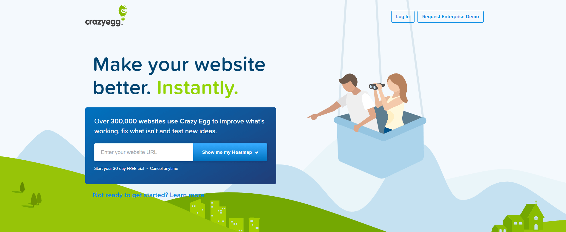
- "Show me my heatmap" - Crazy Egg uses this type of call to action because it automatically engages the user straight away, you know exactly what you're getting and who's getting it
- "Buy now" - Square's card reader landing page, despite being super simple, makes total sense to the user and is above the website's fold too
- "Create my CV" - if you're looking to create or update your CV, then specifying exactly what you're going to get from the button makes perfect sense here
- "Request Demo" - if you've read KissMetric's landing page, then their simple CTA copy says exactly what you're going to get, a demo, but not until you've given some basic details
Why Do I Need A CTA Button?

One of the simplest reasons behind why you're going to want a call to action button on your website and your website pages is to increase and improve the online sales that you're currently getting.
Or, to generate new leads.
Without an obvious "primary" action for a user to complete when they land on your web page, your website's conversion and sales are ultimately going to suffer, and are going to decline.
Some of the reasons why you absolutely must have a clear and concise call to action are:
- You want to generate more leads
- You want to turn leads into paying customers
- You're running ads and want them to convert
- You've launched a product and want people to buy it
- You're figuring out whether a new feature works on your website and are running A/B tests
How To Write An Effective Call To Action In Minutes [3 Step Formula]

How exactly do you write the perfect call to action button in minutes that will convert? I like to break down this process into 3 steps, and this is the 3 step formula to starting...
Step #1: Use Words That Promote Enthusiasm
If you've ever shopped for deals around Black Friday and Christmas, chances are you've seen the terms like:
- Get 50% Off Your Order
Or something similar right?
You've felt the need to click on that button to claim that discount, because Black Friday and Christmas periods are incredibly competitive and you don't want to miss out!
Always pick some words that promote enthusiasm and it will make your CTA button more enticing to click!
Step #2: Pick A Colour Different From Your Landing Page
Colours have meanings, I know it sounds strange doesn't it, reds typically signify aggression whereas blue tends to be more conservative.
Depending upon your website's colour scheme, you're going to want to to choose a colour opposite from your primary colour to use as your call to action button's colour.
What do I mean?
If your website's primary colour is cyan for instance, then look to have a red for your CTA buttons, it'll make them naturally more obvious for the user to click. You can use a colour wheel and a colour calculator to figure out what colour to use!
Step #3: Put The CTA Above The Fold
A common misconception about the web, is that people don't scroll. Whilst it might have some truth, a study based on 2 billion website visits found that 66% of the user's attention is found below the fold, where users apparently don't scroll right?
But here's the thing...
Although users do scroll, if you're buying ad traffic and running ads to your website, you're probably going to want to keep your CTA above the fold since this is where you're going to instantly be able to capture the attention of your users and get them to take some kind of action.
You're going to want a primary call to action above the fold, but also, why not have one just below the website's fold as well?
Along with some copy outlining exactly what your landing page or product is all about.
Conclusion

Crafting and positioning call to actions throughout your website will ensure that you're driving website traffic to where it's needed and where the customer wants to be.
The overarching issue is that most websites don't make it obvious that they're clickable, either they don't use the right colours or are using the wrong formula.
That's why I've curated this content specially for you, and for you to share with those people that are having issues with their CTA buttons on their websites.
Related Articles
More posts
What Is a Subdomain Takeover and How to Prevent It
A subdomain takeover lets an attacker claim your subdomain by exploiting dangling DNS records. Learn how it happens, real-world examples, and how DNS monitoring detects it.
Read moreWhat Is Mean Time to Detect (MTTD)?
Mean time to detect (MTTD) measures how long it takes to discover an incident after it starts. Reducing MTTD is one of the highest-leverage improvements in reliability engineering.
Read moreWhat Is Black Box Monitoring?
Black box monitoring tests your systems from the outside, the way users experience them — without access to internal code or infrastructure. Learn how it works and when to use it.
Read moreSubscribe to our PRO plan.
Looking to monitor your website and domains? Join our platform and start today.